
Techniques to visually point people to take action
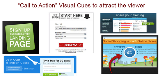
A “CTA – call to action’s” main purpose is to get a visitor on your site/blog/social feed to do something. That something could be to “read more”, add product to shopping cart, download something, sign up or practically just about anything. Because of this, there are many factors that go into creating an effective call to action button or statement.
Your buttons consist of two main elements – design and text copy, both are important and have direct impact on conversion. They answer two key questions, where to click and why!
Buttons themselves can vary in sizes and colour, the rule of thumb typically is to have the colour of the button contrast to other colours on the site. Have it big enough to stand out, but not too big. Draw attention to the buttons by adding physical pointing graphics such as arrows, or positioning of a graphic leading your eye to the button. The text should say more than “Submit“, in fact it should explain what and why. Example, “Download Free Report For Easy Conversions”
The position of the button should be above the fold, either top right and then another middle left. Above the fold, means first screen width and height.
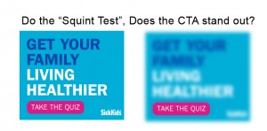 A good test to do when reviewing button colours and choice of shapes is to do the “squint test” – A simple A/B test: take a few steps back, squint your eyes and see what stands out. Click To Tweet
Take a look at the shape and size of the button, the button colour, the text colour on the button. Keep it simple and don’t go overboard with creative ideas.
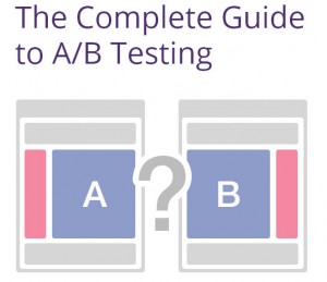 You can also consider doing A/B Split tests with a control group and treatment group. Test over a select period of time, measure the conversion rate.
Here is a related article on 12 Game-Changing A/B Testing Tips for 2014 brought to you by visualwebsiteoptimizer.com
Other key considerations when planning your CTA’s are the following:
- Create a sense of urgency in your text copy
- Prioritize buttons by positioning and sizing
- Differentiate the “buy” versus “free” buttons
- Make sure the text copy around the button supports the button function
For some other resources check out,
- https://www.optimizely.com/ab-testing
- http://www.sitepoint.com/5-tips-for-creating-an-effective-call-to-action-button
- http://www.canva.com
